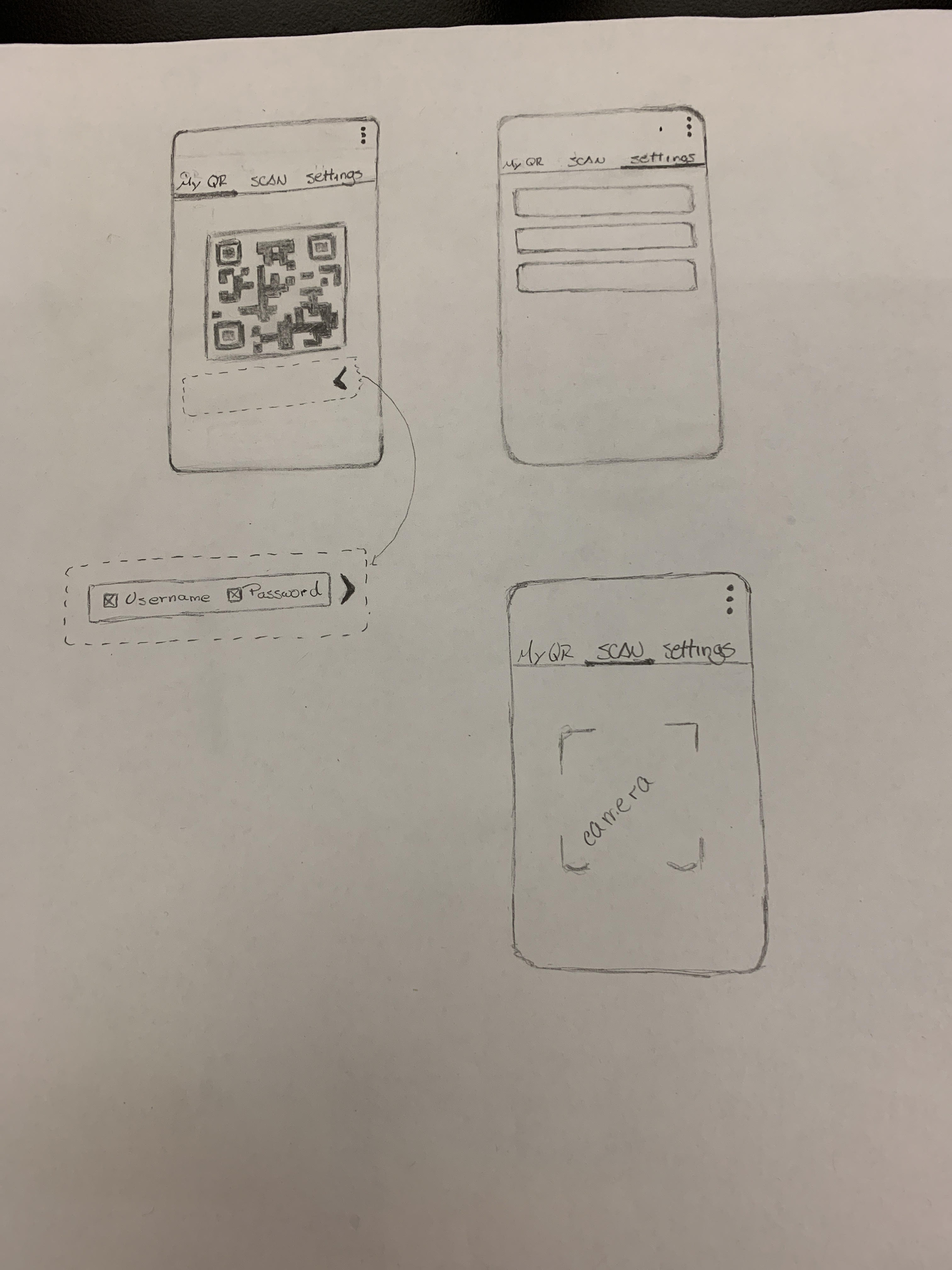
Me and my group are currently working on a new design for the QR code screen. It has been brought to us that the current screen needs improvement, and we wanted to redesign it and implement it using material design.
Our idea is to separate the Qr Code screens utilizing a tab at the top. We wanted to have two - three separate screens.
One for the QR code and a drop down carrot button so one can take the password and username off the QR code,
One for scanning another QR code which would make use of the camera,
One for the settings, which would hold the username and password. (This would only be there if the user is an admin)
Lastly, upon a successful scan, currently the user is directed back to the Main Menu, but we want to change it to redirect to the server settings in the general setting options.
We are still in the progress of finishing our designs for the screen. This is a rough sketch of what we currently have:
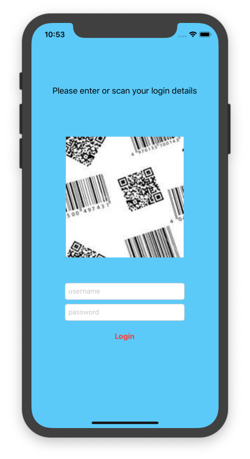
Something to think about... when using a QR/bar code to capture critical (text) data - eg login info required to gain access - I typically include text entry field(s) as a fallback, in case the code is unreadable in the field for some reason. In this case, I would have probably added a username and password TextField, which would automatically get prefilled upon successful QR scan (from associated live camera view), but if the scan fails, its too dark, etc the user can still just type them in and tap login. eg
Basically, the QR code is presented as a more convenient, alternative input mechanism, alongside the primary method. Both UI elements would be simultaneously visible. Just a thought...
@Xiphware To add on to this idea. The initial idea of the design was to change the original feature that allows the user to remove their username and password from the QRCode with a cleaner design with the checkboxes. I think we can also use your idea to make this design such that the user can regenerate the QR code with different credentials and would have to save the changes otherwise it would revert back. That way users can remove usernames and passwords and change their credentials in the same interface.
I don't understand the settings tab, could you say more about what it's intended for?
Passwords, accounts and authentication are a little unusual in Collect so it might be helpful for me to describe in some detail. In typical apps, you'd just be prompted for a username and password because the app itself would know about the service it was talking to (e.g. PayPal). Collect does not know anything about the service it's communicating with and that is one of the things that needs to be configured. It's possible for a remote service to provide anonymous access for data collection or to do something like embed authentication information in a URL. That means username and password are optional.
Admin passwords are optionally set locally on individual devices. This is useful in scenarios like an organization hiring hundreds of lightly-trained staff to perform data collection when the organization doesn't want the staff to change e.g. the server or username or whether forms should auto-send. There's no such thing as an admin account or an admin username. The admin password just provides an easy way to limit access to certain features. This QR code feature is obviously sensitive since it lets a user reconfigure Collect including its passwords. That means that you should assume that if this device has an admin password set, the user has had to enter it before seeing the QR code screen.
The idea with the QR code is that it makes it possible to exactly duplicate the configuration of one device on another. That means the QR codes could potentially be sensitive:
If a server password is set in general settings, that will be included in clear text by default but should be removable
If an admin password is set in admin settings, that will be included in clear text by default but should be removable
Server URLs can potentially contain a sensitive key that will always be included in clear text
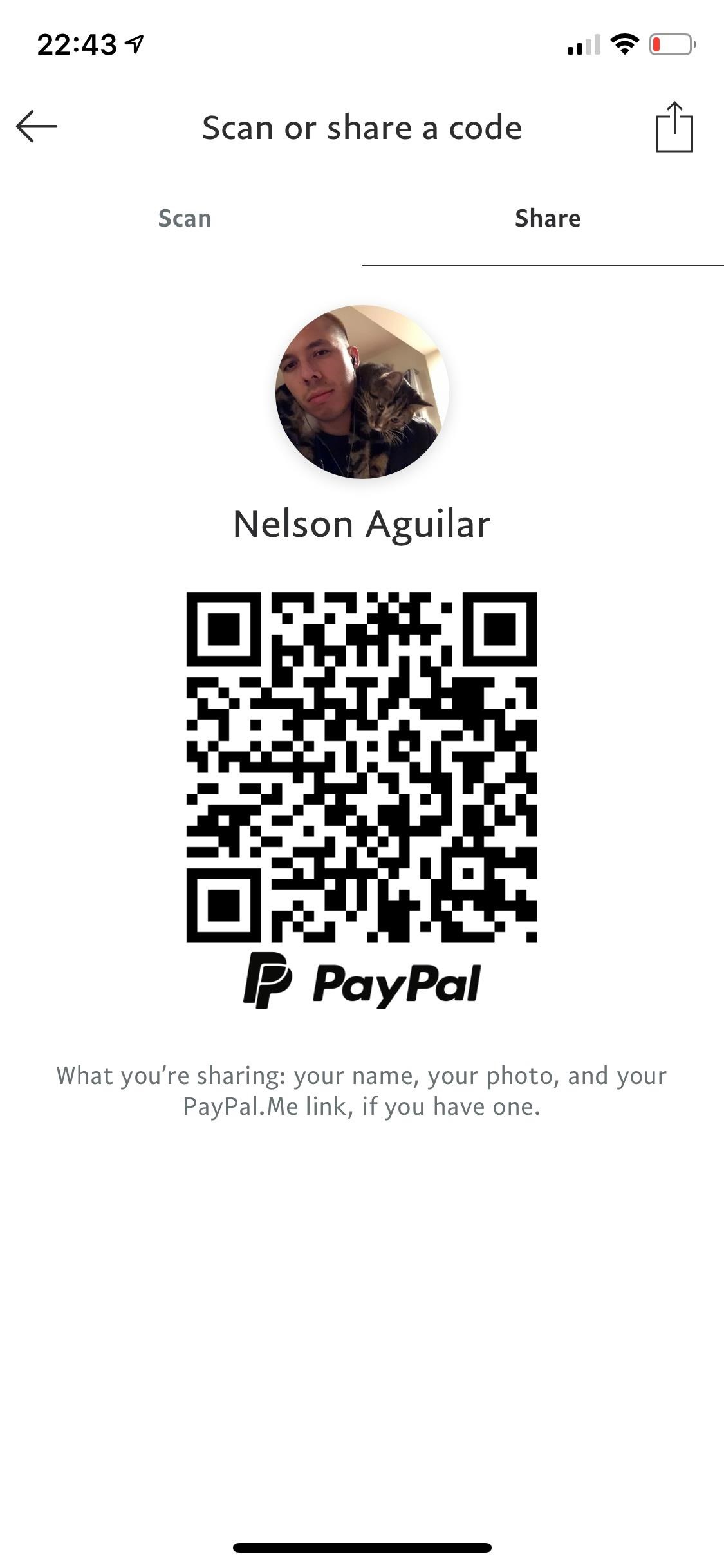
This is different from, say, your PayPal QR code which does share user identifying information but no passwords. It's really important that the user gets a warning if any of these three sensitive values are set. I don't feel as strongly that they must be removable from the QR code (as is possible now).
I like what @Xiphware has shared above for a purely login QR code. In Collect's case, we're talking about a QR code that may or may not contain server identity, server credentials, client UI configuration, etc. I don't think duplicating some subset of fields from settings on the QR code screen is appropriate.
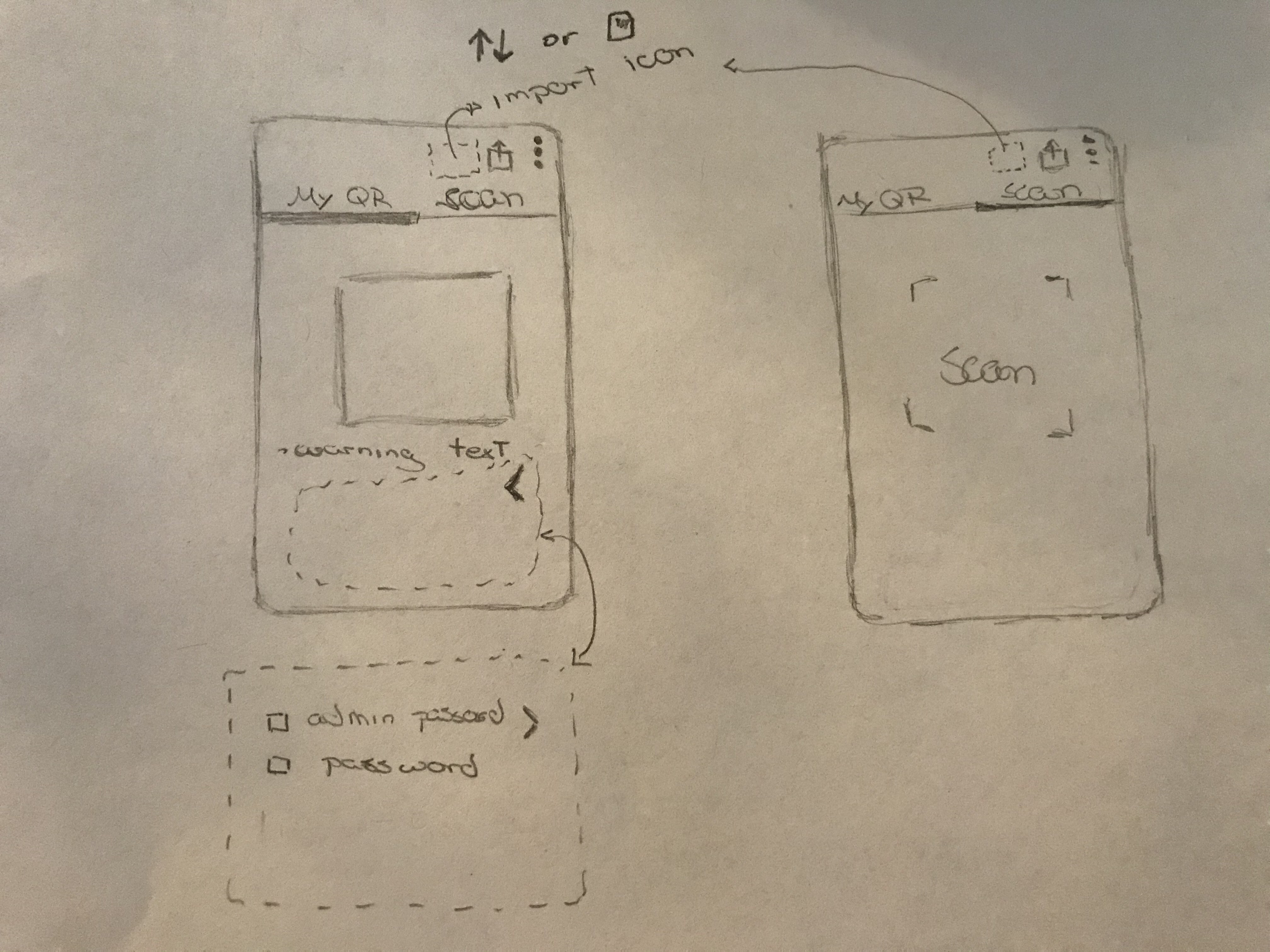
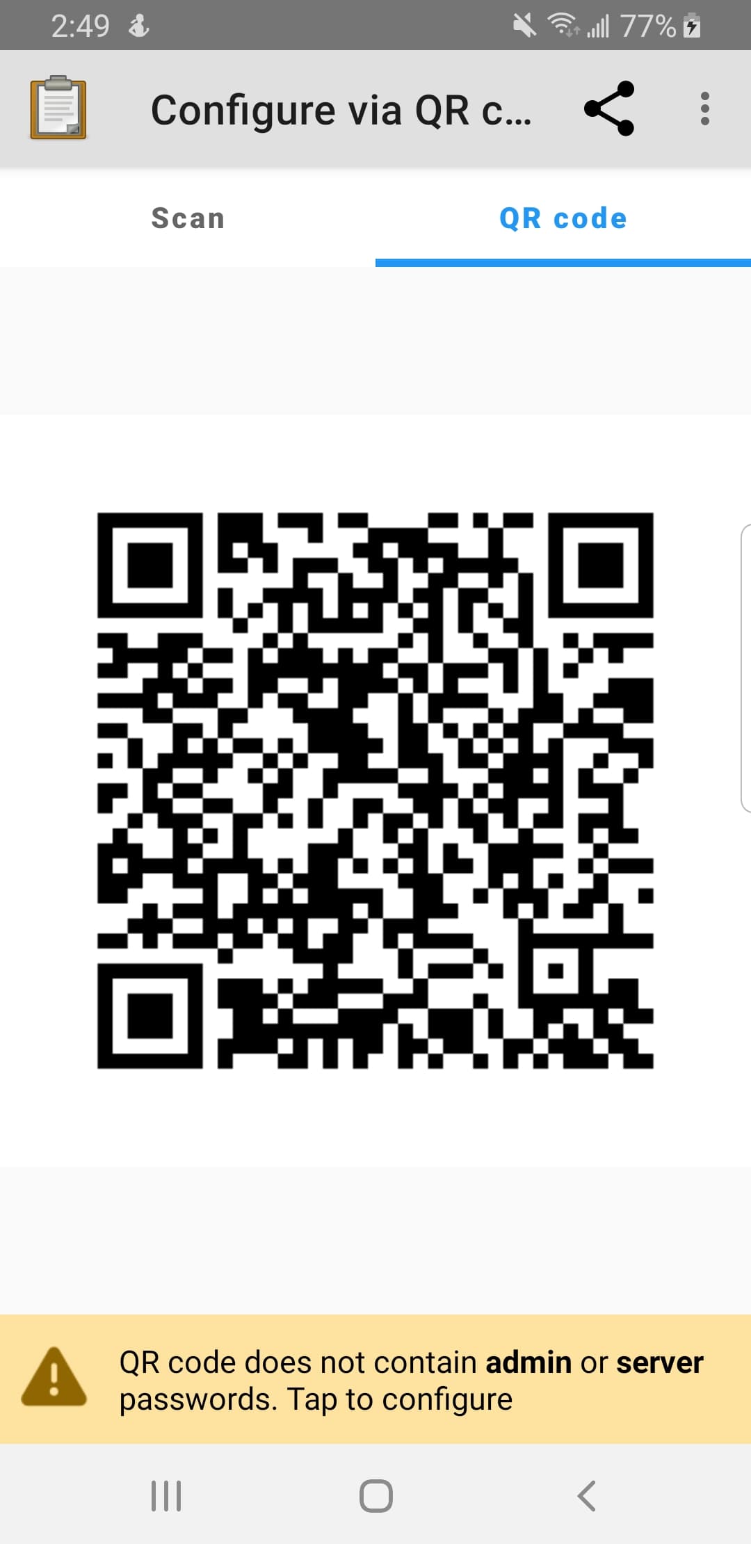
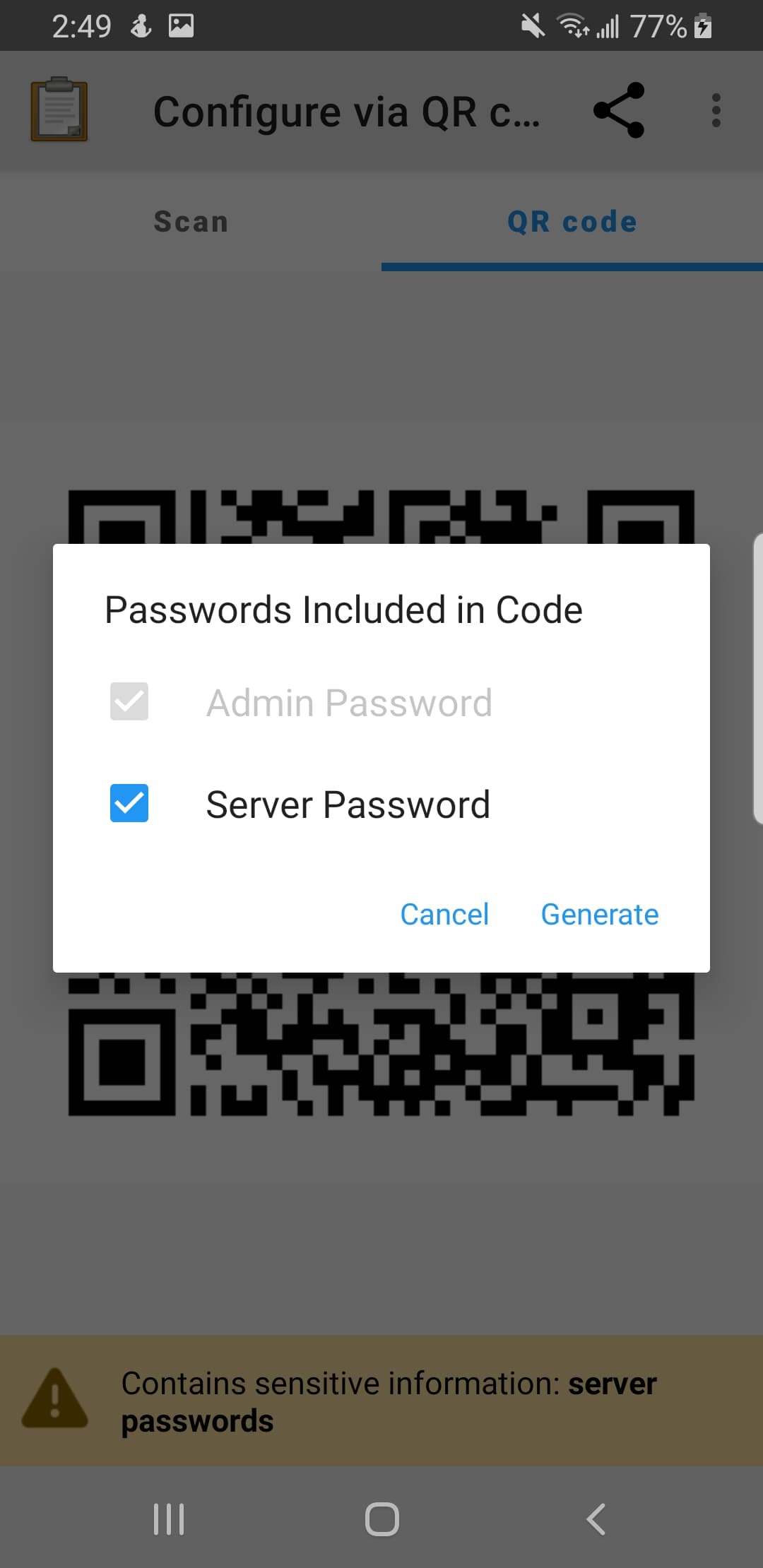
We plan on having a warning text under the QRCode that lets the user know that the QR Code will contain the passwords. We will have 2 checkboxes(admin password, server password) for the passwords so that users can uncheck them in case they want to share data without giving away theirs passwords.
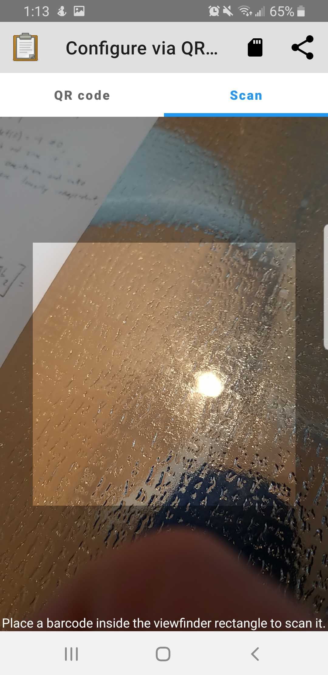
The scan a QR code button (scan code from other device) would be replaced with an embedded scanner in the next tab.
The share button would be replaced with a share icon on the action bar.
The Import a QR code (select code from SD Card) button would be replaced with the an icon in the action bar. I was thinking between these:
I'm leaning towards the first because although some people will not know what it means once it is clicked it would display a message such as "Import from SD card" which would make it very clear in future usages. The second one could imply that you will import the QRcode from somewhere. The third one could also imply that you are going to look for a QR code from storage. Many apps seem to be using an SD card or a modified image with an SD card or folder for the same functionality. (Note that all the icon are from https://materialdesignicons.com/)
The overall goal of this new interface change is to improve the UI/UX for users, so the usage of icons in the action bar would be a big contributing factor to it. Let us know what you think of these changes!
I'm liking the design/navigation of this. It keeps all the options accessible in one place (import, scan and read still live together) but also makes it clearer what options are there by moving them to the top of the screen. The tabs feel like a good way to represent these "opposite" actions as well. Just two thoughts:
Import is usually represented as this icon in Material: https://material.io/resources/icons/?icon=import_export&style=baseline. However I'm a little worried it's going to be unclear whatever we pick. I'm wondering if we should move both share (export) and import into the overflow menu so they can have text attached.
Hi everyone, we are currently developing this and have made progress on implementing the basic functionality. This post is an update to our progress and some questions we ran into:
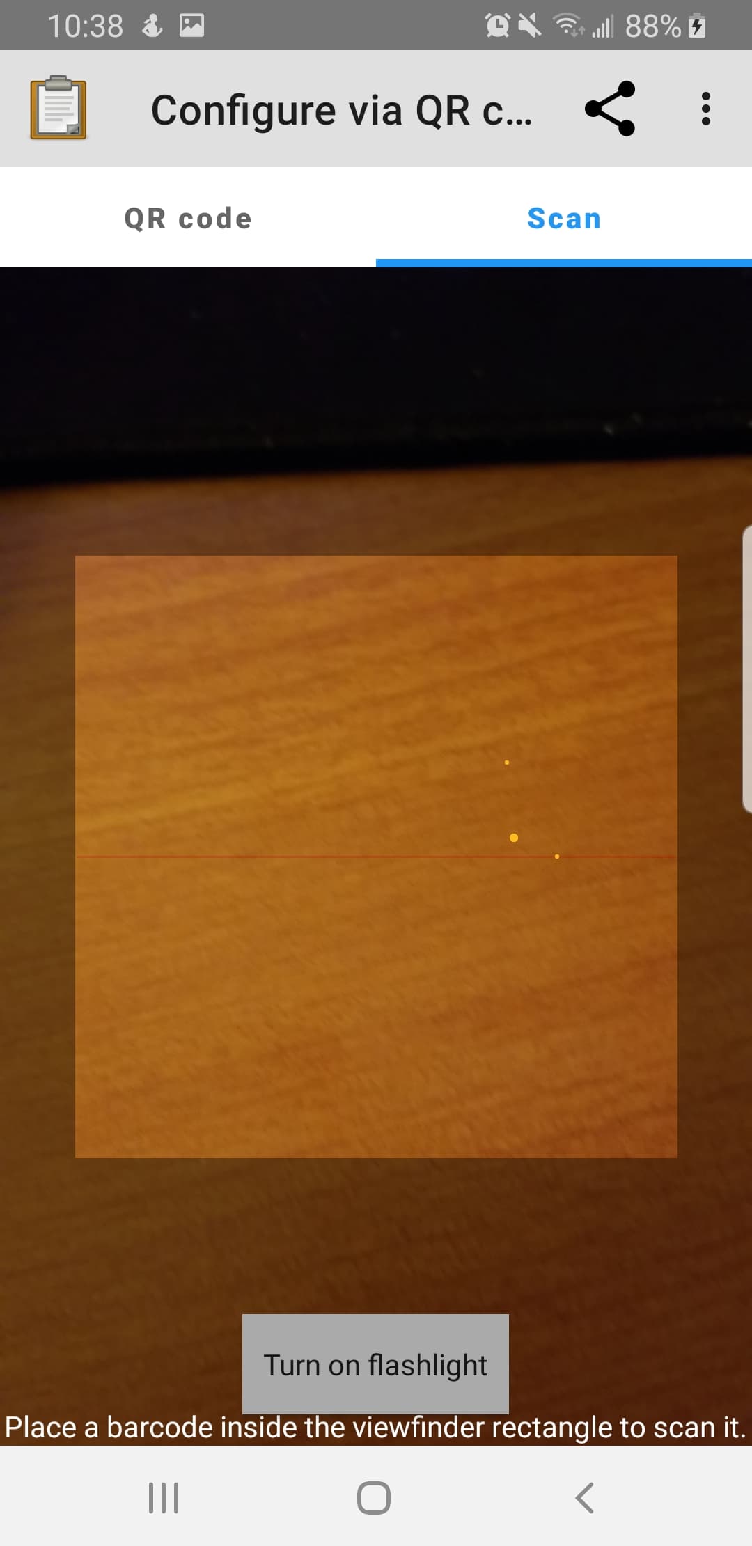
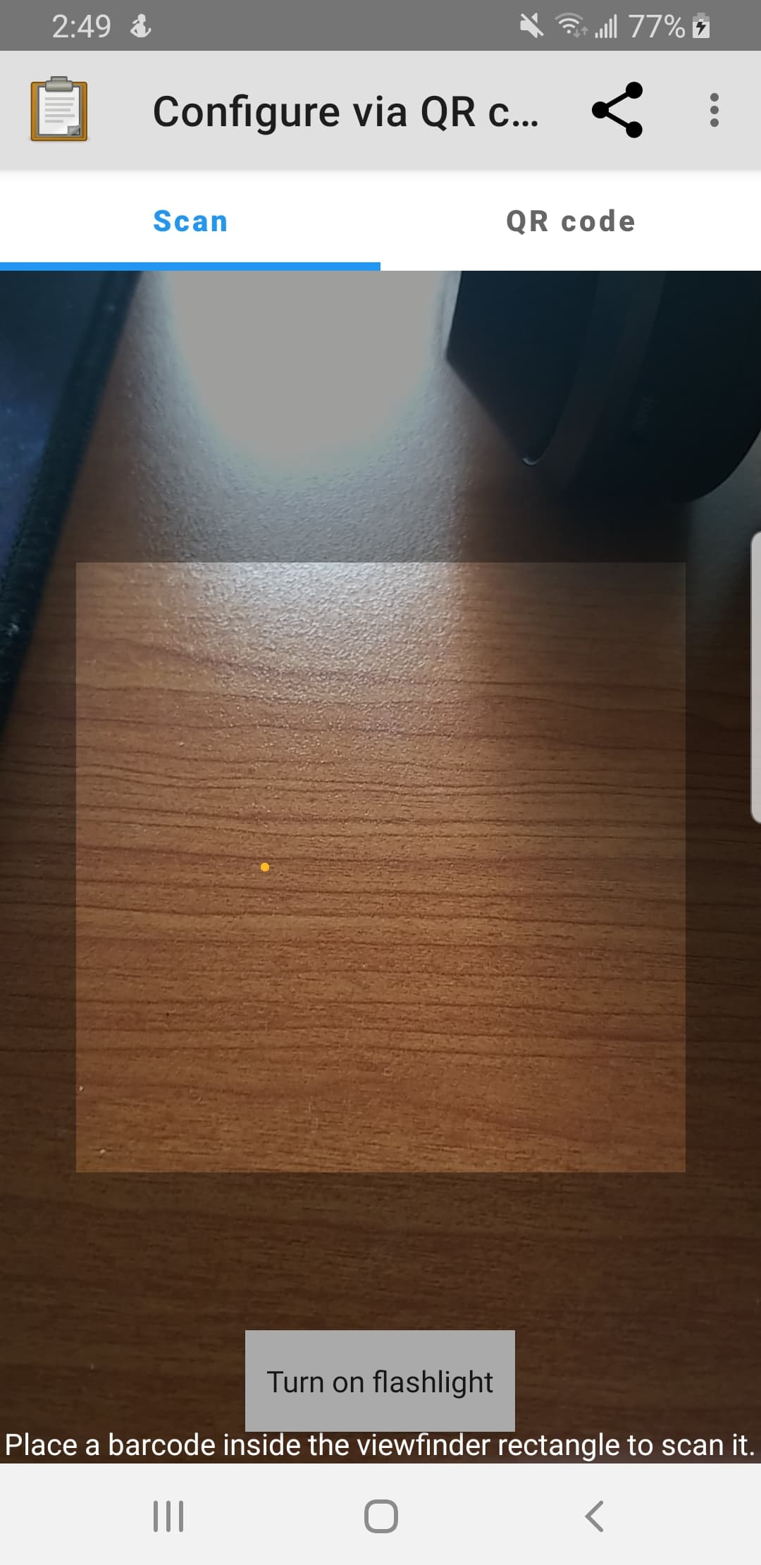
should the embedded camera have a "Turnon Flashlight" option, this was a feature of the original ScannerActivity
on successful scan, should the user still be redirected back to the MainMenuActivity or would it make sense to go back to the QR Code tab
should the order of the two tabs be switched? since then the QR Code Menu Item can go directly to this activity and the QR Code scanner would automatically be shown first
I think this is a good idea. What do you think, @hypercubestart? I don't really have expectations around what the sdcard icon would do. Maybe share could stay as the current icon and import could go in overflow since we don't think import is likely to be very common? Or do you think the two should be consistent, @seadowg?
I think the flashlight functionality was mostly added for scanning QR codes during a form filling session. We specifically got requests from users who scan barcodes in low-light conditions. I think that configuration is a lot less frequent and much more likely to happen in a controlled environment like an office. For those reasons, I don't think the flashlight functionality is critical but it would be nice to have. Is there some technical limitation that leads you to remove it?
I don't think that going to the QR Code tab makes sense. There's nothing there that would make sense for a user to do next -- they just scanned a code so they don't need to scan or export it again. I tried other applications that have QR code scanning functionality and they always go to a screen relevant to the code that was scanned. In this case, I think users are likely to either want to check their settings to make sure they're as expected or download forms. I think that going to the main menu activity is the most helpful thing to do.
I agree with @seadowg that the icons will be a little unclear no matter which icons we use, so I don't really have a preference there. I think the only problem with putting share/import into a overflow menu is that users may have trouble finding the features/knowing it exists. So I am slightly leaning towards icons, but I do not have a strong preference towards one or the other.
I'll give an update on the flashlight, but we are currently using a third-party library built ontop of zxing to embed the camera into the fragment. I will need to dive into the docs to check if the library supports customizations, but this would be the technical challenge of introducing a flashlight feature.
I think it depends on whether we think we're optimizing for repeat use (people know what the buttons do and so want easy access) or discoverability (people don't know what they're options are). Thinking about it again we probably shoudn't change the icons or their positioning unless we have a good reason to as it could disrupt people's workflows.
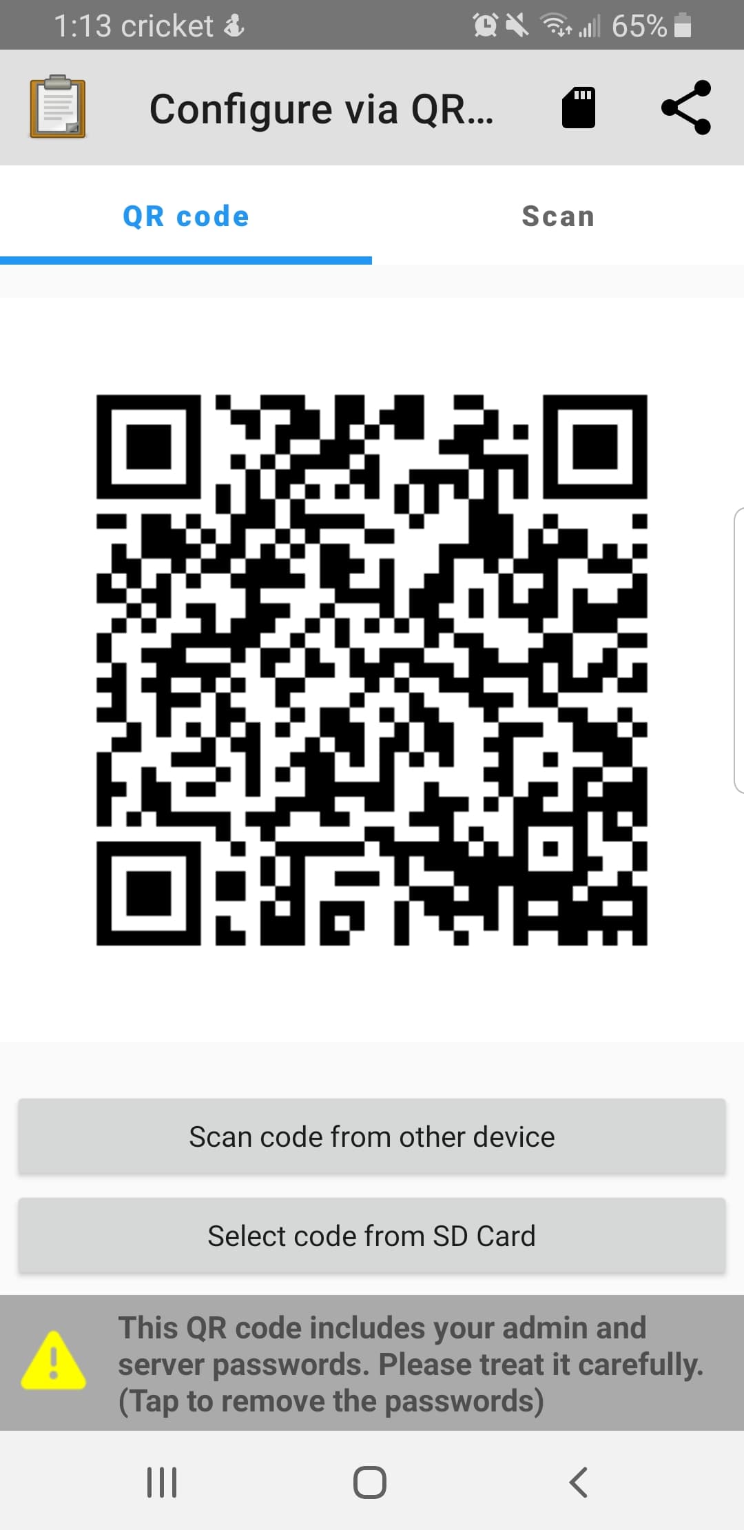
Quick progress update, critical feedback appreciated. Here is the design we came up with. The share icon remains in the menu, but the Import QR function has been moved into the overflow menu. With recommendations from @LN, we omitted the checkboxes for admin password and password, which are currently accessible via pressing the warning message (this is how the password checkboxes currently are designed). The warning message would change based on if the passwords are set and whether the user chooses to remove them from the generated QR Code.
We tried swapping the tab order so that the Scan screen is first, but it felt unnatural. The tradeoff is that pressingConfigure via QR Code menu item from the MainMenuActivity would send the user to the second tab, which may feel a bit unnatural to the user as well, but I think is the better option. any ideas/thoughts/opinions would be very helpful here!
the feature to include the admin/server password is hard to find. Is this okay? If not, should we add the password checkboxes again like in the original design above?
(related to previous question) if the user unchecks both passwords, I was planning to remove the warning message completely. However, then the user will have no way of accessing the checkbox dialog to reinclude the passwords. My idea is to replace the warning message with a info message along the lines Tap Here to Configure QR Code. Any thoughts or ideas appreciated!
My assumption would be that the "Scan" tab will be used far more than "QR code" here as generally peopel setup one "reference" device and then scan from it on many more devices. It would be good to have it as the first tab. It doesn't look like we have analytics to validate my assumption here but I guess we could add them as part of this work and I'm sure @LN has some good anecdotal evidence.
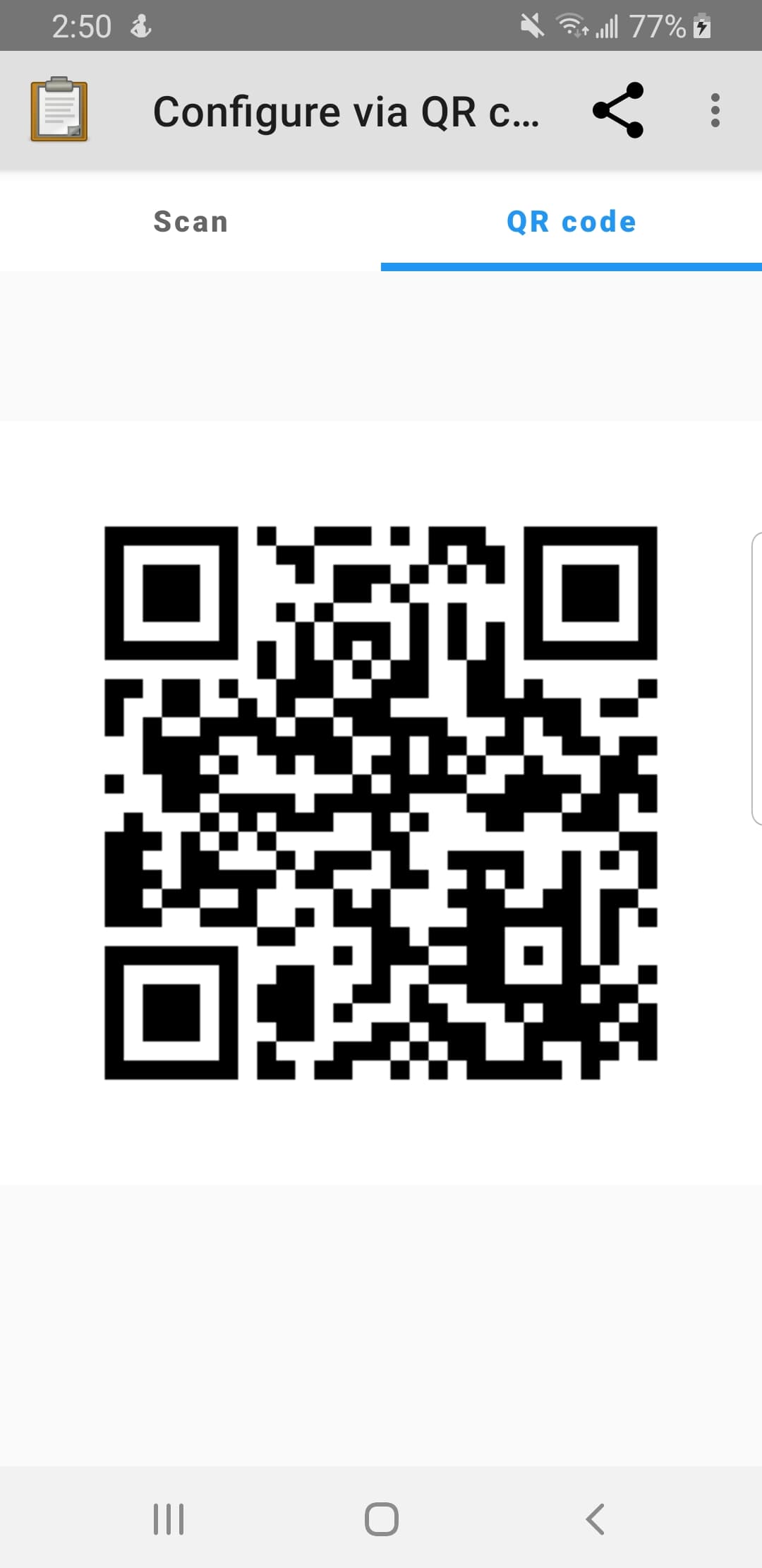
QRScannerFragment. As per @seadowg suggestion, it is the first fragment. The main menu Configure via QR Code item also redirects the user to this screen now.
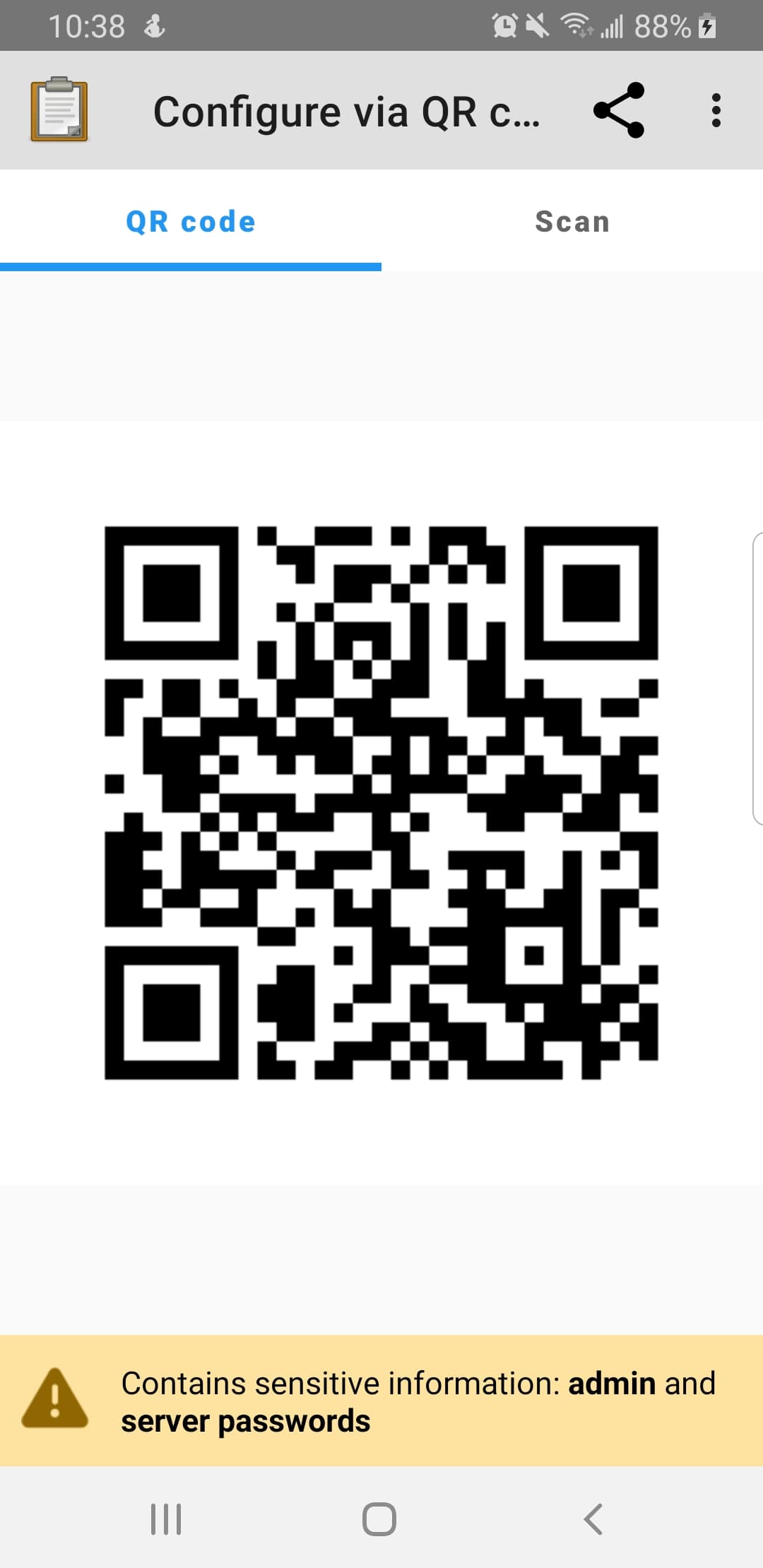
ShowQRCodeFragment. The warning text is absent when admin password/server password are not set.
ShowQRCodeFragment. Warning text when admin/server password are not included in QRCode. This is the warning text when no passwords are in the qr code. For example: if admin_pw.isEmpty() and !server_pw.isEmpty(), if the user removes the server_pw, then this warning text will display. If !admin_pw.isEmpty() and is also removed, this same warning text will be displayed.
ShowQRCodeFragment. admin_pw.isEmpty() and !server_pw.isEmpty(), checkBox for admin_pw is disabled because admin password is not set.
That looks good! I think that once this set of improvements is finalized and merged we should consider following up with modernization of the flashlight button. I'd also like to consider customizing the instruction text so that it says something about a settings QR code.
I was previously suggesting leaving no specialized way for someone to remove passwords from the QR code. That is, I wouldn't even keep the dialog. If someone really doesn't want those passwords in there, they can change the configuration. That said, the text you have come up with looks fine to me. We can put some analytics to see how often folks use the functionality.