with modifier show-buttons or markers that can apply to any of them.
And just to add my problem with this proposal is that compact actively hides radiobuttons and checkboxes, and then we have to undo that with show-buttons. So for same question were undoing part of an appearance that we just added.
Ideally compact would not hide radiobuttons and checkboxes at all, and a modifier hide-buttons could hide them when desired, but that would break backwards-compatibility of old forms. Hence we've been struggling with redesigning a more logical appearance design for select questions that doesn't break anything. If we could come up with a synonym for compact that would allow us to do that.
While I agree it doesn't feel very clean/pure when you state it that way, I don't think that has user impact. In other words, I think someone really has to sit down and think about the appearance names to start feeling uneasy. It's really easy to describe why the modifier goes in that direction with something like "the compact-* appearances are particularly useful for images. Arranging text choices horizontally is also useful and can be achieved by adding show-buttons". As an added bonus, show-buttons can be added to vertical lists (or any other type) and the fact that it has no impact makes perfect sense. If we had a modifier to remove buttons, we'd have to either support it for vertical lists (doesn't seem very useful) or feel uneasy about why we don't.
As an added bonus, there are no compatibility issues and so no user surprises. Given the number of forks and otherwise out of date clients floating around, I think that is worth giving some weight to for a relatively minor adjustment like this.
compact and compact-n would continue having the same meaning
horizontal would become compact-auto show-buttons
horizontal-compact would become compact show-buttons
Because there's no overlap between new appearance combinations and the ones that would remain for backwards-compatibility, I think the implementation is straightforward. Old forms would always work with new clients. New forms that use compact-auto show-buttons and compact show-buttons would likely interpret that as compact which is not exactly what is desired but really not bad.
I think it's really about convincing @martijnr that the approach is not terrible! To be clear, I completely agree that if we were starting over we would hopefully do this differently.
she requires a double appearance value of "compact-auto show-buttons" instead of just "columns" or something. To me this seems the most common use case, judging from the (small subset of all) the Enketo forms I get to see. I understand Collect doesn't have this feature yet, but we may see the same with Collect users when it does.
To me it seems that users are more likely to want to keep the radio-buttons and checkboxes. So having to remove them in order to show columns and then bring them back with another appearance, just doesn't seem like a great re-design (I'm diplomatic here!). I cannot escape the feeling that we can do better than that (without breaking backwards-compatibility of course).
I'd find using a double appearance to a) show columns and to b) remove checkboxes/radio-buttons more logical.
I certainly do agree with that. But so far the tradeoffs for what we've explored haven't seemed worth it.
Maybe the proposal we started this thread with can be salvaged by not reusing compact. That is, something like introducing
columns (currently horizontal),
columns-n (like current compact-n but with radio buttons/checkboxes) and
columns-flex (currently horizontal-compact)
no-buttons as a modifier that applies to all (and perhaps vertical lists?)
The "new form on old client" case is not as nice as what we discussed here because those would be shown vertically. But we can mitigate that by waiting to publish user-facing documentation until after upgraded clients have been out in nature for a while, as @martijnr suggested.
I guess that @martijnr you were suggesting to keep using compact to address that somewhat but I think it is much harder to explain and keep straight than three base behaviors with a consistent modifier.
That's a nice twist. I'm in favor of this proposal.
I realize some people are going to miss compact (though it's not actually going away - just in the documentation in 6 months or so) but I think this is well-designed and something we can defend.
Just to be clear, compact isnt really a 'modifier' to another appearance setting - rather its one of the fundamental appearance types in XForms spec. [so for backwards compatibility we probably shouldn't be mucking about with it...]
Typically, a style sheet would be used to determine the exact appearance of form controls, though a means is provided to suggest an appearance through attribute appearance. The value of the attribute consists of one of the following values:
"full": all choices should be rendered at all times. "compact": a fixed number of choices should be rendered, with scrolling facilities as needed
"minimal": a minimum number of choices should be rendered, with a facility to temporarily render additional choices
My (rough) interpretation is that "full" is all the bells and whistles, all the time. "compact" is a fixed visible # but scrolling set of some (or all) the bells and whistles. And "minimal" is a fixed # non-scrolling set of some (or all) the bells and whistles. Interestingly, the spec example shown omits the checkboxes for 'compact' and only shows the item labels, but does show the checkmarks for "minimal", suggesting the implied 'dimension' they span doesn't necessarily dictate which actual bell's and whistles to show, but rather whether seeing the full list involves scrolling vs a more explicit user action, eg hitting a "More..." button [hence "...with a facility to temporarily render additional choices"]
While there's certainly wiggle room on how to interpret "compact", I really dont think we should consider defining "compact" as being a modifier on some other (custom) appearance value. That strikes me as a clear violation of the intention in the original spec.
Which is to say, "compact" implies scrolling, so some other modifier to it would optionally specify which suite of eye candy to display for each item.
The compact of the ODK world has never had anything to do with the compact from the W3C spec (and it is implemented consistently across ODK ecosystem clients). So if anything, I think that's an additional reason to deprecate the ODK-custom-compact and make clear that ODK XForms appearances are not related to W3C XForms appearances.
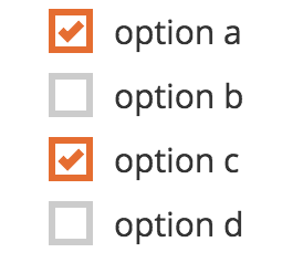
It works for text-only choices as well but in practice is most useful with images. That's where the desire to add something that works exactly like the current compact but does retain radio buttons/checkboxes comes in. That would be what the latest proposal would call columns-flex.
Are we ready to say that the latest take has stood the test of time? I continue to feel ok about it.
@Grzesiek2010, since you're likely to take on the implementation change on the Collect side and were looking at this recently, it would be great for you to look over this thread and share what you think.
We're finally about to finalize the implementation of the new appearances in Collect and I'm noticing that I flipped columns and columns-flex between the first post in this thread and the one we ultimately agreed on. Now I'm no longer sure which should be which.
@martijnr, have you made the switch in Enketo? If so, which did you go with? If not, what makes more sense:
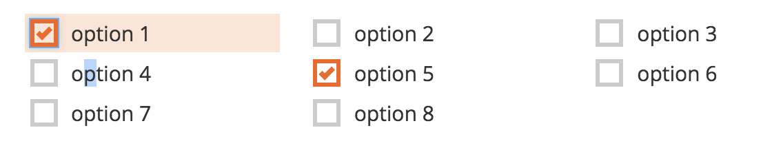
columns is the one that works on a grid determined by screen size and columns-flex is the one with choices packed in with minimal padding
columns-flex is the one that works on a grid determined by screen size and columns is the one with choices packed in with minimal padding
Let's not beat this poor dead horse any more. I searched for columns-flex in https://github.com/enketo/enketo-core where I'm pretty sure it would be defined and it's not there which suggests Enketo has not gotten this change yet.
@martijnr is the one who suggested columns and columns-flexhere so let's go with how he described them there which is option 1 above. I have edited my post here to try to minimize confusion (hah).
I find it hard to grok what columns-flex means from the name. The description of the behavior makes me think that columns-pack or columns-compact might be clearer.
Sigh. Given that I got confused, I certainly can't argue that columns-flex is the most intuitive name. I think we should avoid compact as we've discussed previously.
columns-pack would make sense. How do we finalize this decision and when do we decide to call it done, @yanokwa?
I cant remember (I recall I might have asked this WAAAAY back?) but was it ever determined whether you could have multiple appearances? Seems like we want two, or three (vs 4+): one to enable columns, another to define spacing, another for buttons or not?
 Fuuuuun!